1906–1948 · Story
The brand that carried a patriotic code
The letters on the frame could be read as a political sentence. Victories did the rest.
Five letters
Pietro Dal Molin took over the Wilier name in 1906. After the Second World War it acquired a clearer political meaning. Trieste was disputed between Italy, Yugoslavia and the Allies, and Dal Molin added Triestina to the name.
WILIER was explained as “W l’Italia LIbera E Redenta” — long live free and redeemed Italy. The company also adopted Trieste’s halberd and hired Giordano Cottur from the city. A racing bicycle became both product and political sign.
The copper-red bicycle
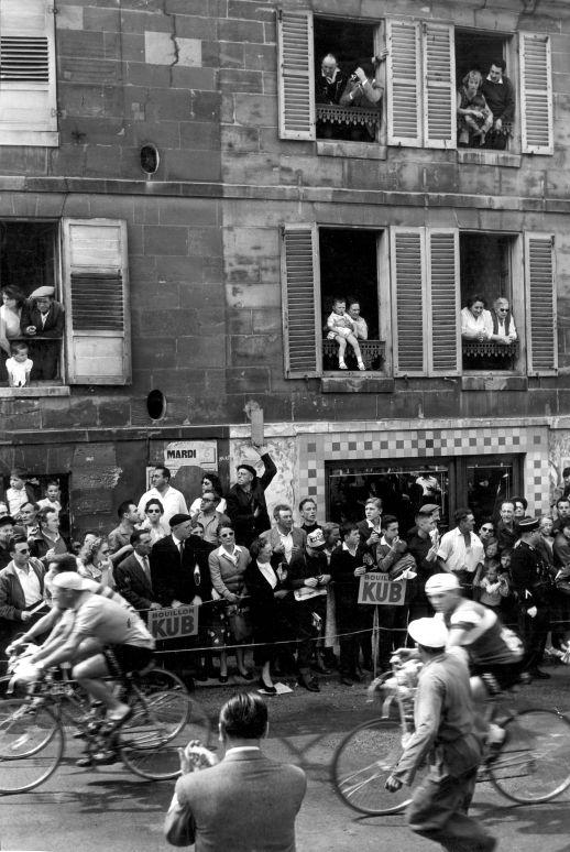
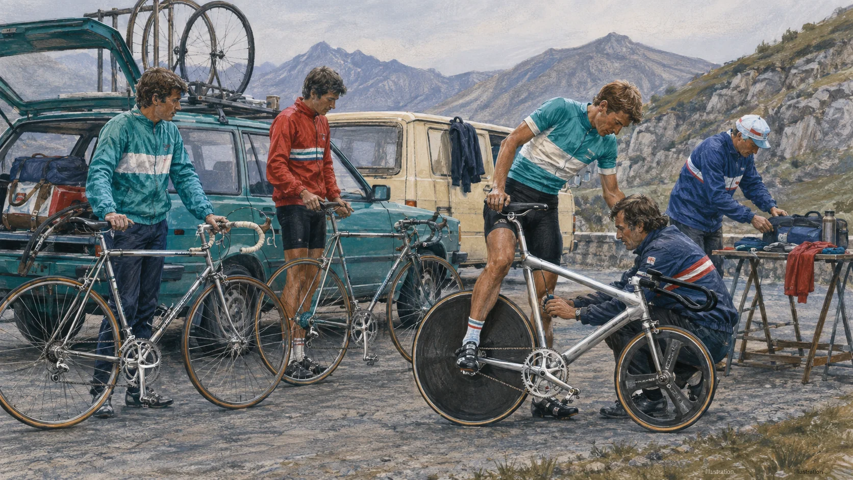
The team put the code in motion. Victories followed from 1946 to 1950, and Fiorenzo Magni won the 1948 Giro overall. Cottur was third, Giulio Bresci seventh and Alfredo Martini tenth. The classification made Wilier visible between Bianchi and Legnano.
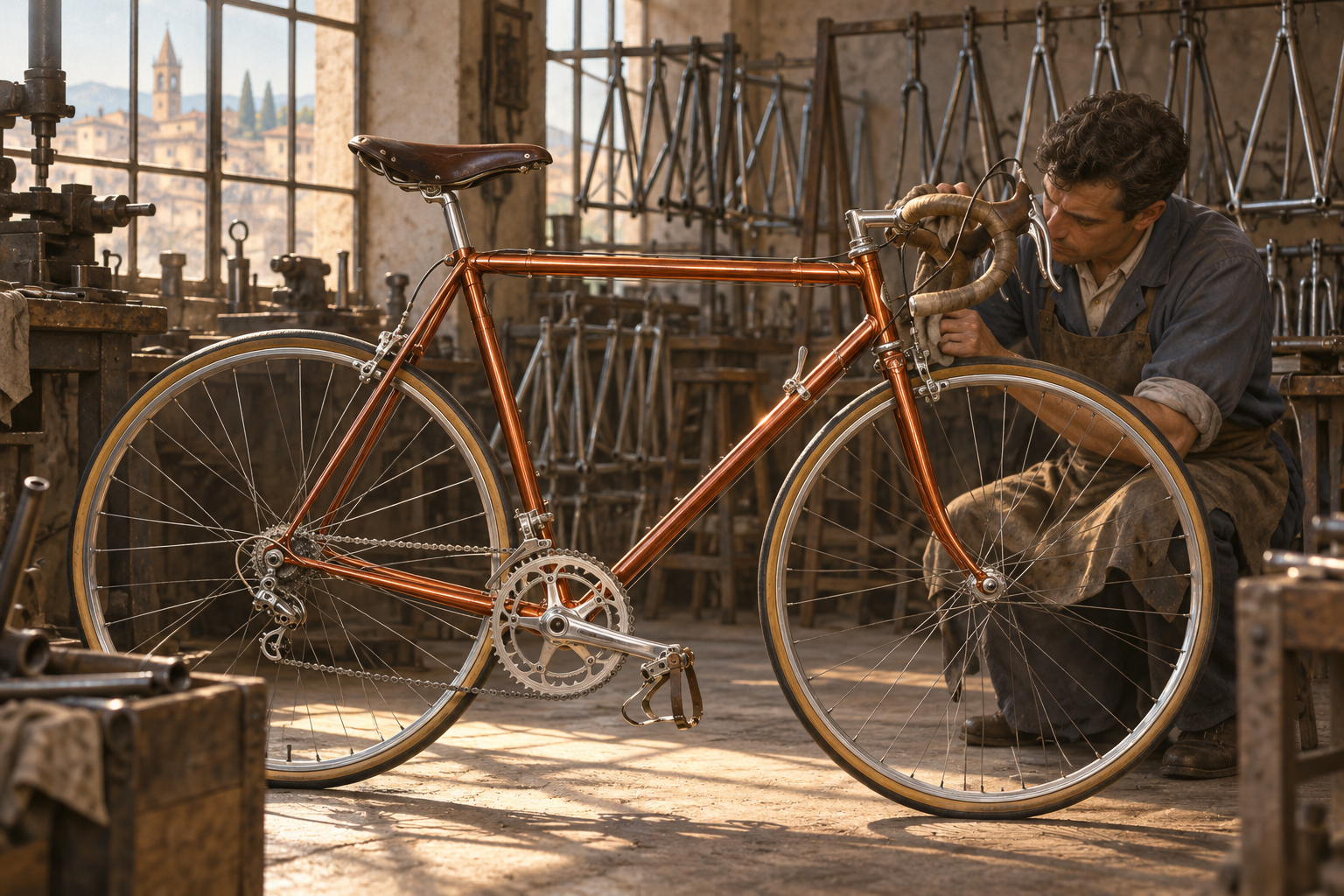
The copper-red finish became another identifier. Wilier dates its first certified Ramato bicycle to 1947. Translucent copper colour over bright metal gave the steel tubes depth and could be recognised even when the name was unreadable from the roadside.
Politics became surface
Company histories often make every thread neat. The name’s early origins and exact development of the acronym are less clearly supported independently. The post-war use of Triestina, the halberd, Cottur and the results are clearer in the company archive.
There is no need to turn the 1906 bicycle into a secret manifesto. The documented post-war moment is stronger: a manufacturer took a side in the dispute over Trieste and used team, symbol and copper finish to carry the message onto the road.
When a frame also became a flag
Post-war Trieste was not merely a name from which a manufacturer could borrow a little prestige. The city’s allegiance remained an open political question, and Italian symbols carried a weight they would not have possessed on an ordinary domestic product. By adding Triestina and adopting the halberd, Wilier made the bicycle a visible statement. That did not mean every buyer or rider shared one precise political view. It did mean the factory deliberately chose a language that contemporary spectators could decode.
The Ramato finish made the message physical. Its translucent surface required careful preparation because the steel remained visible beneath the coloured coating. From a distance it appeared as a warm copper tone; close up it revealed joints, tubes and workmanship. Colour therefore served as both technique and identity. At a time when many team bicycles appeared in black, blue or conventional red, Wilier could become recognisable without changing the basic form of a racing machine.
Results in the Giro gave those symbols credibility as a bicycle brand. Magni, Cottur and their teammates did not make the political code more true, but they made certain it was seen. That combination is what makes the Wilier story distinctive: acronym, civic emblem, finish and team all worked in the same direction. The brand spoke about Trieste, but it still had to prove itself as a bicycle. On the road, patriotic feeling alone could not carry a steel frame across the line first.
A powerful story could not protect the business from a difficult market. The post-war bicycle boom faded, mopeds and other forms of transport changed demand, and Wilier closed in the early 1950s. The name later returned under new ownership. That does not make the earlier story less coherent, but it marks the difference between an iconic appearance and a stable concern. The Ramato finish and Giro victory could remain in memory even when the factory that created them could no longer continue unchanged.
When a later Wilier carries copper colour or a halberd, it therefore points back to more than a decorative tradition. The signs belong to a particular post-war moment when the cycle industry, professional racing and the question of Trieste met. The modern bicycle is not the same machine, and the company is not the same factory. Yet the symbols work because real riders once made them visible on real roads. That is the difference between merely choosing a colour and building an identity around it.